

The Uncomfortable Truth About Jewelry Ecommerce in 2026
You are not running a traffic problem. You are running a conversion problem. And the data makes that distinction painfully clear.
The average ecommerce store converts somewhere between 2% and 4% of its visitors. Jewelry — the category that trades on emotion, aspiration, and intimate personal meaning — sits at 0.9%. The lowest of any vertical online.
Think about what that means in real terms. For every 1,000 people who land on your product page, 991 leave without buying. Some of them were your ideal customers. Some had their credit card in hand. They still left.
This article is not a list of generic UX tips. It is a detailed breakdown of exactly what drives those departures, stage by stage, based on patterns observed across more than 20 jewelry stores generating between $100,000 and $2 million in annual revenue.
What the Conversion Data Actually Shows
The benchmark figures going into 2026 tell a consistent story:
- Jewelry and luxury ecommerce converts at 0.9% — the lowest of any product category online
- Cart abandonment in the luxury and jewelry vertical reaches 82.84% — again, the highest of any sector
- Mobile abandonment climbs even higher, to 85%, driven by checkout friction and poorly adapted interfaces
- 68% of luxury shoppers cite inadequate product detail visibility as the primary reason for leaving without purchasing
These are not random failures. They are structural. And they are fixable.
Why Jewelry Is the Hardest Category to Convert Online
Jewelry occupies a category unlike almost any other in retail. The purchase decision is simultaneously emotional and rational. It is personal yet often bought as a gift. It carries financial weight alongside symbolic meaning. And it cannot be touched.
Every one of those characteristics is a conversion barrier waiting to be triggered. A customer who cannot feel the weight of a ring, cannot test its clasp, cannot see how a pendant sits against the collarbone — that customer is operating on faith. Your job as a merchant is to earn that faith before they reach checkout. Most stores never attempt it.
The 6 Reasons Jewelry Visitors Leave Without Buying
Reason 1 — Your Photography Is Failing the Sensory Test
Online jewelry shopping is a sensory substitute exercise. The customer cannot hold the piece. Photography is not a supplement to the sale — it is the sale.
Products with professional-quality photography convert at rates approximately 33% higher than those without. Lifestyle photography, showing a piece worn in context, can lift conversion a further 19–33% on top of that. And yet the majority of independent jewelry stores still operate with two or three flat-lay images taken under inconsistent lighting.
What the research consistently shows is that customers need to understand scale, texture, movement, and wearability before they commit. A single overhead shot on a velvet pad communicates none of those things. It asks the customer to imagine. And imagination, at the point of purchase, defaults to doubt.
- Minimum requirement: 6 images per SKU — front, back, side, clasp detail, model worn, scale reference
- Gold and silver demand macro close-ups to show hallmarks and finish quality
- Video loops (5–8 seconds, no audio) showing movement increase add-to-cart rates measurably
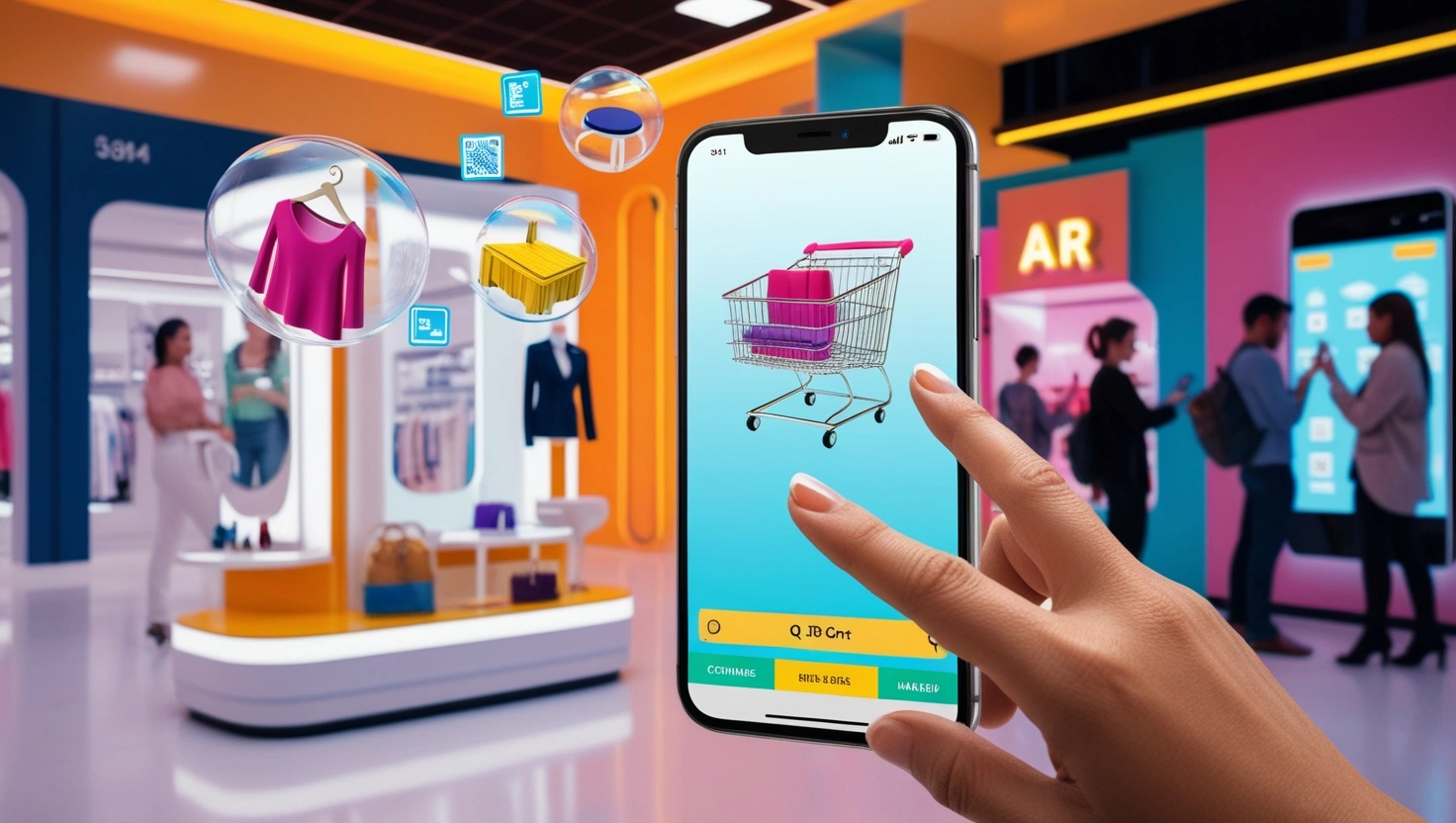
- AR virtual try-on tools, now accessible to mid-market brands, have shown a 32.7% increase in add-to-cart rates and a 17.4% reduction in returns in 2026 data
Reason 2 — The Trust Architecture Is Missing
Jewelry purchases above £150 / $200 require trust infrastructure that most independent stores simply do not have in place. The customer is not being irrational when they hesitate — they are responding to genuine signals of risk that your site is emitting.
Trust in jewelry ecommerce is not just a security badge in the footer. It is a layered system of credibility signals that must appear throughout the customer journey, not just at checkout.
- Hallmark certification displayed prominently on product pages, not buried in FAQs
- Third-party review platforms (not just on-site star ratings) — Trustpilot, Google Reviews, with verified buyer labels
- Real customer photos in reviews — not stock imagery or text-only testimonials
- Material sourcing transparency: ethically sourced gemstones, recycled gold, conflict-free certification
- Clear maker or designer story — who made this, where, under what conditions
- Physical address and phone number visible in the header or product page — not just the footer
Reason 3 — Mobile Experience Is an Afterthought
More than 70% of jewelry ecommerce traffic now arrives via mobile. And yet the experience most stores deliver on mobile is a compressed, pinch-to-zoom version of their desktop site. That is not a mobile experience. That is a penalty.
The 85% mobile abandonment rate in jewelry is not primarily a payment issue. It is a UX issue that begins long before checkout — with gallery navigation that requires two hands, product descriptions that truncate without a ‘read more’ tap trigger, and checkout flows that were designed for a mouse and a keyboard, not a thumb.
- Gallery images must be swipeable, not clickable arrows
- All primary CTAs must sit within the natural thumb zone (bottom 40% of screen)
- One-tap payment options — Apple Pay, Google Pay, Shop Pay — must appear before standard card entry
- Size guide and ring sizer tools must be accessible without leaving the product page
- Load time on mobile must be below 2 seconds — every additional second costs approximately 7% of conversions
Reason 4 — Your Checkout Is Bleeding Revenue
A customer who adds an item to cart has already made the emotional decision to buy. Cart abandonment at that stage is almost entirely caused by friction your checkout introduces — not doubt about the product.
The average jewelry checkout in the independent market involves five or more steps and demands account creation before purchase. This is the single highest-impact conversion leak in the entire funnel.
- Forced account creation before checkout eliminates a significant portion of impulse and first-time buyers
- Unexpected shipping costs revealed at the final step are the leading driver of last-moment abandonment across all ecommerce
- Lack of instalment payment options (Klarna, Afterpay, Laybuy) removes the luxury mid-market segment — shoppers who want the piece but are managing cash flow
- No progress indicator in checkout increases perceived friction and uncertainty
- Checkout pages not optimised for mobile autofill lose 15–20% of mobile completions
|
🏆 Gainer Digital Pro-Tip #1: The Two-Step Checkout Fix The single highest-impact structural change we make to jewelry checkout flows is collapsing to two steps: (1) email + shipping, (2) payment. Guest checkout must be the default — not a secondary option below the account creation form. In 11 of the last 14 stores we restructured, this change alone produced a measurable lift in completed purchases within the first 30 days, without any changes to traffic or product mix. Secondary implementation: add a single-line trust reminder directly above the payment button — ’30-day free returns. Authenticity guaranteed.’ — and watch hesitation at the final click drop sharply. |
Reason 5 — Product Pages Don’t Speak to Emotion
Jewelry is not bought for its technical specifications. It is bought for what it represents: a proposal, an anniversary, a self-gift after a difficult year, a mother’s keepsake. Product copy that leads with weight in grams and chain length in millimetres is communicating to a logistics team, not to a buyer standing at an emotional threshold.
The most effective jewelry product pages follow a specific structure. Emotional hook first — the story of the piece, who it is for, the occasion it serves. Then material quality and craftsmanship, framed as evidence of the emotion, not as standalone specs. Then practical details — sizing, metal options, delivery — positioned as reassurance rather than the lead.
- Open with the feeling, not the feature: ‘Worn as a daily reminder of where you came from’ beats ’18ct gold vermeil, 2.3mm chain width’
- Use sensory language: weight, warmth, shine, texture — words that simulate touch through reading
- Write for the gift-giver as well as the recipient — two different emotional registers, both present in your traffic
- Include a single sentence about craftsmanship process: handcrafted, cast-set, hand-finished — these phrases activate quality perception disproportionate to their length
Reason 6 — You Haven’t Addressed the ‘What If’ Objections
At the point of purchase, three fears dominate the jewelry buyer’s mind. They will not voice them in a chatbot or write them in an abandoned cart email reply. But they are there, and if your product page does not address them, they win.
The Fear of Buying Blind
‘What if it looks nothing like the photos?’ This fear is answered by volume and variety of photography, by AR try-on where available, and by a prominently stated, genuinely easy returns policy. Not easy in the sense of ‘technically possible.’ Easy in the sense of ‘I can see the return label button from here.’
The Fear of Getting It Wrong (Sizing, Gifting, Fit)
Rings are sized. Bracelets have wrist measurements. Chains vary in how they sit. A customer buying a gift does not know the recipient’s ring size. If your store does not solve this problem directly — with a ring sizing guide, a ‘free resize within 60 days’ policy, or a gift-note-with-size-card option — you lose the gift purchase entirely. Gift purchases represent a disproportionate share of jewelry revenue, particularly in Q4.
The Fear of Wasting Money on Something That Looks Cheap
Gold-plated versus gold-filled versus solid gold. Sterling silver versus silver-plated. These distinctions matter enormously to buyers who have been disappointed before. If your product page does not proactively explain your materials hierarchy — and clearly differentiate your product from lower-quality alternatives — the customer’s past negative experience with a different brand becomes your conversion problem.
|
🏆 Gainer Digital Pro-Tip #2: The Objection Map Before writing a single word of product copy, we run every new client through what we call an Objection Map: a structured list of every question a hesitant buyer could ask about this specific piece. The rule is simple: if the question can be answered on the product page, it must be. If it requires a customer service interaction, it is a conversion leak. In our experience, most jewelry product pages answer 3–4 of the 12–15 relevant objections. The gap between 4 and 12 is often the entire difference between a 0.9% conversion rate and a 2.1% conversion rate. |
The Gainer Digital Optimization Framework
The six failure points above do not exist in isolation. They compound. A customer who encounters weak photography will not trust the brand enough for your excellent checkout to matter. A flawless product page cannot recover a mobile experience that takes 6 seconds to load.
The framework we apply across client stores addresses these problems in sequence — because sequence matters. Fixing checkout before fixing trust signals is like polishing a car before replacing the engine.
Stage 1 — Visual Trust System
This is always first. Before any copy, technical, or flow work, the visual layer must communicate quality and authenticity at first glance. This means:
- Full photography audit and reshoot brief (or AI-enhanced image processing for existing assets)
- Brand visual consistency across all product images — consistent background, lighting temperature, model presentation
- Trust badge placement strategy: above the fold on mobile, adjacent to price on desktop
- Review platform integration with real photo functionality enabled
Shopify Photography Guide for Jewelry Stores
Stage 2 — Conversion-Optimised Product Pages
With visual trust established, product pages are rebuilt around the emotional-first copy structure. Objection mapping is completed for every top-10 SKU by revenue. Size guides, material explainers, and gifting tools are embedded directly on the page — not linked to a separate FAQ.
Stage 3 — Friction-Free Checkout Architecture
Checkout is restructured to two steps maximum. Guest checkout is made the primary path. Instalment payment options are integrated. Mobile checkout is tested on five devices before deployment, with specific attention to autofill compatibility and touch-target sizing.
Stage 4 — Post-Click Retention & Recovery
A three-part abandoned cart email sequence is deployed: the first email within 60 minutes (no discount — just a gentle reminder with the product image and a single trust signal), the second at 24 hours (addressing the most common objection for that product category), and the third at 72 hours (optional discount, framed as a limited availability signal rather than a desperation offer).
SMS recovery, where consented, adds a measurable additional recovery layer, particularly effective for purchases above $300 where the emotional attachment to the item lingers.
Generic Jewelry Store vs. Gainer Digital-Optimized Store
The table below captures the structural differences between a typical independent jewelry store operating at 0.9% conversion and a Gainer Digital-optimized store operating at 2.0–2.5%:
|
Conversion Factor |
Generic Jewelry Store |
Gainer Digital Optimized |
|---|---|---|
|
Photography |
1–2 static flat-lays, inconsistent lighting |
6–10 angles, macro close-ups, lifestyle context shots, video loop |
|
Trust Signals |
Generic ‘Secure Checkout’ badge only |
Hallmarks, certifications, real reviews with photos, material sourcing story |
|
Mobile UX |
Desktop-ported layout, pinch-to-zoom images |
Thumb-zone checkout, swipeable galleries, single-tap payment options |
|
Product Copy |
Spec-first (weight, dimensions) |
Emotion-first narrative + specs below the fold |
|
Objection Handling |
No sizing guide, no gifting support |
Ring sizer tool, gift messaging, free resize policy, ‘Try Before You Buy’ framing |
|
Checkout Flow |
5+ steps, forced account creation |
Guest checkout, 2-step flow, Shop Pay / Apple Pay / Klarna |
|
Cart Abandonment Recovery |
No email sequence |
3-part email sequence + SMS touchpoint within 1 hour |
|
Returns & Guarantee |
Buried in footer |
Prominently on product page: 30-day free returns, authenticity guarantee |
|
Page Speed |
3–5 second load time |
Sub-2-second load, lazy-loaded images, WebP format |
|
Post-Purchase Trust |
Order confirmation email only |
Personalised unboxing guide, care instructions, loyalty invite |
The Revenue Math: What Fixing This Is Actually Worth
The 1% Lift Scenario for a $1M Brand
Abstract conversion rate improvements become very concrete when expressed as revenue. Consider a jewelry brand generating $1,000,000 in annual online revenue:
- Current conversion rate: 0.9%
- Monthly sessions (assumed average order value $180): approximately 46,000
- Monthly transactions: 414
- Monthly revenue: ~$74,500
After a 1 percentage point conversion improvement — from 0.9% to 1.9%:
- Monthly transactions: 874
- Monthly revenue: ~$157,300
- Additional monthly revenue: ~$82,800
- Additional annual revenue: ~$993,600
One percentage point of conversion lift on a $1M brand is worth approximately $1M in additional revenue. Without adding a single new visitor. Without increasing ad spend. Without changing a product.
The traffic is already there. The opportunity cost of an unoptimised store is not theoretical — it is accruing daily.
Ecommerce Conversion Rate Benchmark Report 2026
Frequently Asked Questions
What is a good conversion rate for a jewelry website?
The industry benchmark sits at 0.9% for luxury and jewelry ecommerce. A well-optimised independent jewelry store operating with strong photography, trust architecture, and a clean checkout can achieve 2.0–2.5%. Stores with personalisation, AR tools, and active recovery sequences have reached 3%+ in specific product categories.
Why is jewelry so hard to sell online compared to other categories?
Jewelry relies on sensory cues that the internet cannot deliver directly — weight, texture, sparkle, scale. It is also frequently purchased as a gift, introducing additional sizing and presentation uncertainties. And the price points involved trigger risk-aversion that requires active trust architecture to overcome. No other mainstream product category combines all three of these barriers simultaneously.
What is the most impactful single change a jewelry store can make to improve conversions?
Based on consistent patterns across 20+ store builds, the highest single-impact intervention is collapsing the checkout to two steps with guest checkout as the default path. It consistently outperforms photography improvements, copy rewrites, and trust badge additions — though all of those contribute meaningfully when layered on top.
How does mobile affect jewelry ecommerce conversion specifically?
Mobile drives the majority of jewelry ecommerce traffic but converts at a significantly lower rate than desktop, primarily because most stores have not rebuilt their experience for mobile — they have compressed their desktop experience onto a smaller screen. The checkout flow is the highest-friction point, followed by gallery navigation and the accessibility of size guides.
How long does it take to see conversion improvements after optimisation?
Checkout restructuring typically shows measurable improvement within 30 days. Photography changes reflect in conversion data within 45–60 days as new traffic cycles through. Trust signal improvements and copy changes operate on a similar timeline. Full framework implementation across all four stages is designed to show material conversion movement within 90 days.
Do instalment payment options really make a difference for jewelry?
Substantially, particularly in the $200–$800 price range. Klarna, Afterpay, and similar options shift the mental framing from 'can I afford this?' to 'can I afford $X per month?' — and in jewelry, where the purchase is often aspirational rather than functional, that reframing removes a significant conversion barrier.
Final Word: The Store That Earns the Sale
The 98% of visitors who leave your jewelry store without buying are not indifferent. Many of them wanted what you were selling. They left because the experience between wanting and buying was too uncertain, too slow, too unclear, or too risky.
The stores that convert at 2% or above are not doing something magical. They are doing something systematic. They have removed doubt from every point where doubt can be introduced. They have answered every question before it is asked. They have made the act of buying feel as confident and considered as the emotion that drove the visitor to the product page in the first place.
That is the work. It is not glamorous. But the revenue math makes it the highest-return investment available to any jewelry brand operating online today.